MediaArtTutorials
Composition Techniques IV – Typographic Expression
Objective
Create two typographic compositions that visually express the meaning of selected words by manipulating letterforms. Inspired by Bruno Munari’s ideas in The Shape of Words, this activity explores how typographic form, contrast, spacing, distortion, and composition can be used to visually communicate ideas.
Each composition should:
- Clearly reflect the meaning of the word through visual treatment of type
- Demonstrate conceptual strength and creative experimentation
- Maintain consistency in quality, craft, and style across all three compositions
Software:
- Adobe Illustrator (vector-based composition)
- Adobe Photoshop (texture/image-based processing only)
Activities
Complete the following activities in order. Ask your professor for help if needed.
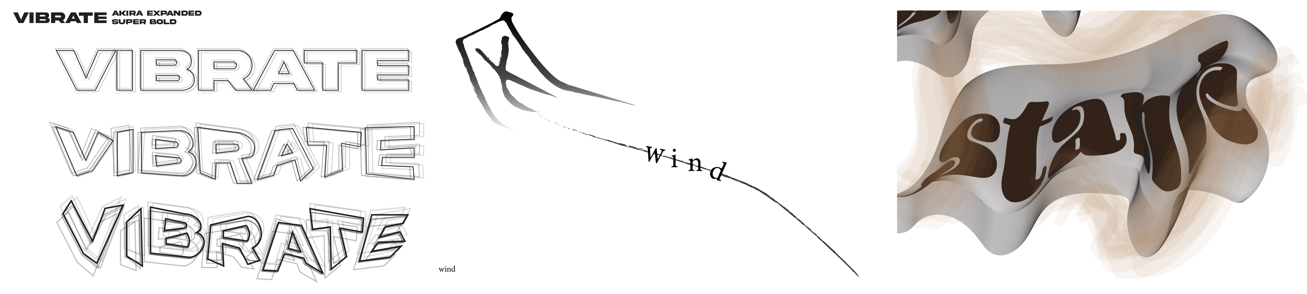
[40–50 min] Tutorial – Recreation Exercise
Task:
Follow the provided step-by-step tutorial on expressive typography to understand how to manipulate letterforms effectively.
- Complete the tutorial exactly as instructed
- Export and upload your final document as your first submission
- Naming Protocol:
Lastname-Firstname-CompTech4-Tutorial.pdf
⚠️ Important: Make sure you follow the document setup instructions to avoid losing points.
[15–20 min] Sketching – Concept Development
Choose two words that you will explore through typographic design.
Create two sketches—one for each word—conceptualizing how you will convey its meaning visually.
Use the following references and techniques:
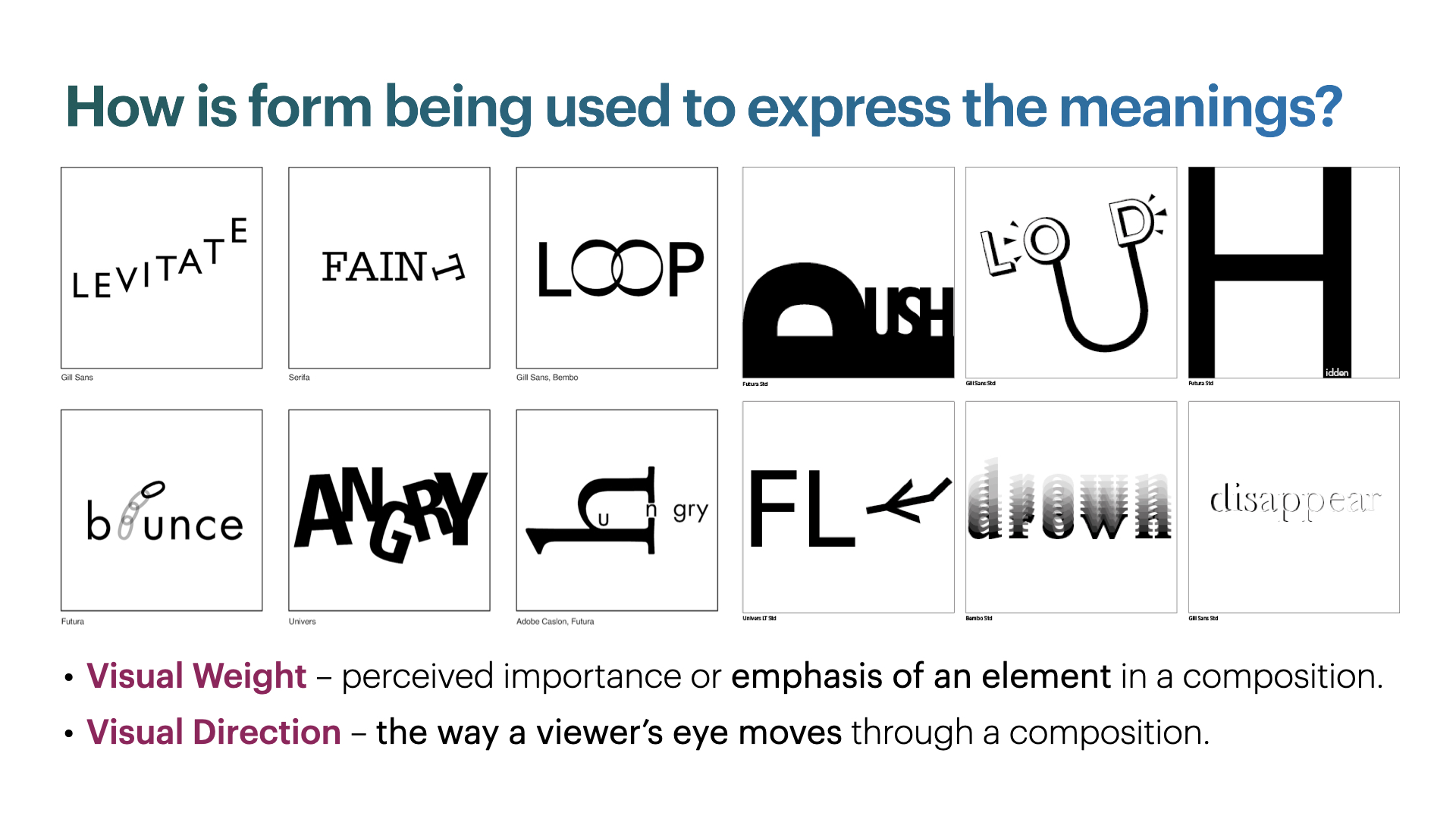
- Munari’s The Shape of Words – Think about how letterforms can reflect meaning
- Visual Weight – Bold vs. light, dense vs. open
- Visual Direction – Flow, alignment, movement
- Design Principles – Wong’s Principles (e.g., contrast, repetition, gradation) or Gestalt Principles (e.g., proximity, continuity, figure/ground)
💡 Tip: Consider how the form of the word enhances the meaning. For example, the word “fall” might descend diagonally, or “sharp” could use angular cuts.
[Rest of Class] Create Your Final Compositions
Document Setup (Required)

Your Illustrator document must include the following settings for Poster Design:
- Naming Protocol:
Lastname-Firstname-CompTech4-# - Units: Inches
- Size: 11 × 17 in
- Bleed: 0.3 in (on all sides)
- Color Mode: RGB
- Raster Effects: High (300 PPI)
Required Layers:
- Guides Layer: Include an inner rectangular border at –0.5 in from the edges.
- Composition Layer: This is where your main shapes should go.
- Background Layer: Add any background colors or images here.
Design Requirements:
- Use Adobe Illustrator to build your final compositions
- Present three variations per word (as done in the tutorial)
- Letterforms must be manually modified
- If using images or textures, make sure they are embedded in the Illustrator file.
Things to Consider:
- Legibility vs. Expression – Ensure the word is still readable while expressive
- Negative Space – Use space intentionally to reinforce meaning
- Hierarchy & Composition – Guide the viewer’s eye across the layout
- Consistency – Maintain a cohesive design style across all three pieces
📥 Final Submission
-
Resulting document from following tutorial:
Lastname-Firstname-CompTech4-Tutorial.pdf - A single PDF file containing your sketches for all four compositions
- Naming:
Lastname-Firstname-CompTech4-Sketches.pdf
- Naming:
- Two separate PDF files, one for each final composition
- Naming:
Lastname-Firstname-CompTech4-1.pdfLastname-Firstname-CompTech4-2.pdf
- Naming:
📌 Failure to follow document setup or naming instructions may result in a grade deduction.