Colour Modes and Values
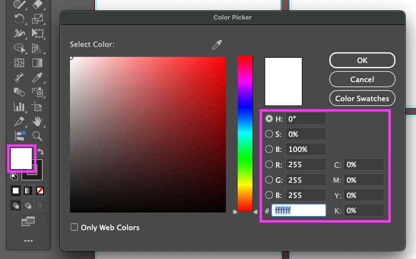
Different colour models describe colour in different ways. Some are connected to a specific output, such as screens or print, while others are useful for selecting, adjusting, and communicating colour.
RGB
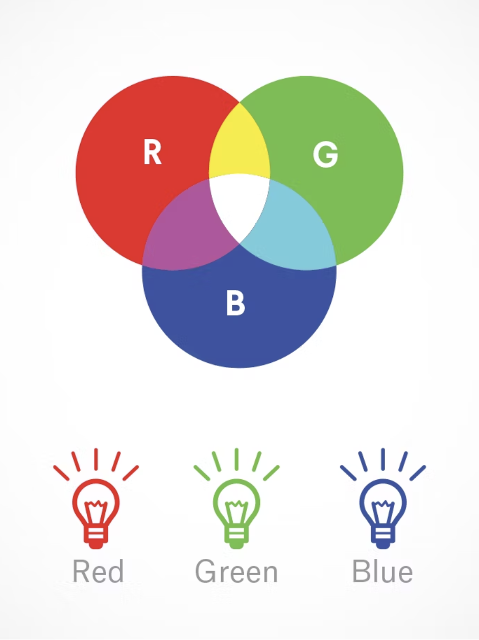
Red, Green, Blue. An additive colour model used primarily for screens and digital media. Different amounts of red, green, and blue light combine to produce colours.
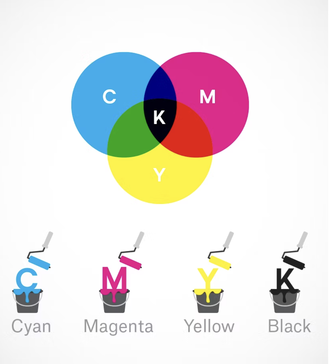
CMYK
Cyan, Magenta, Yellow, Black. A subtractive colour model used primarily for printing. Colours are created through combinations of printing inks on a physical surface.
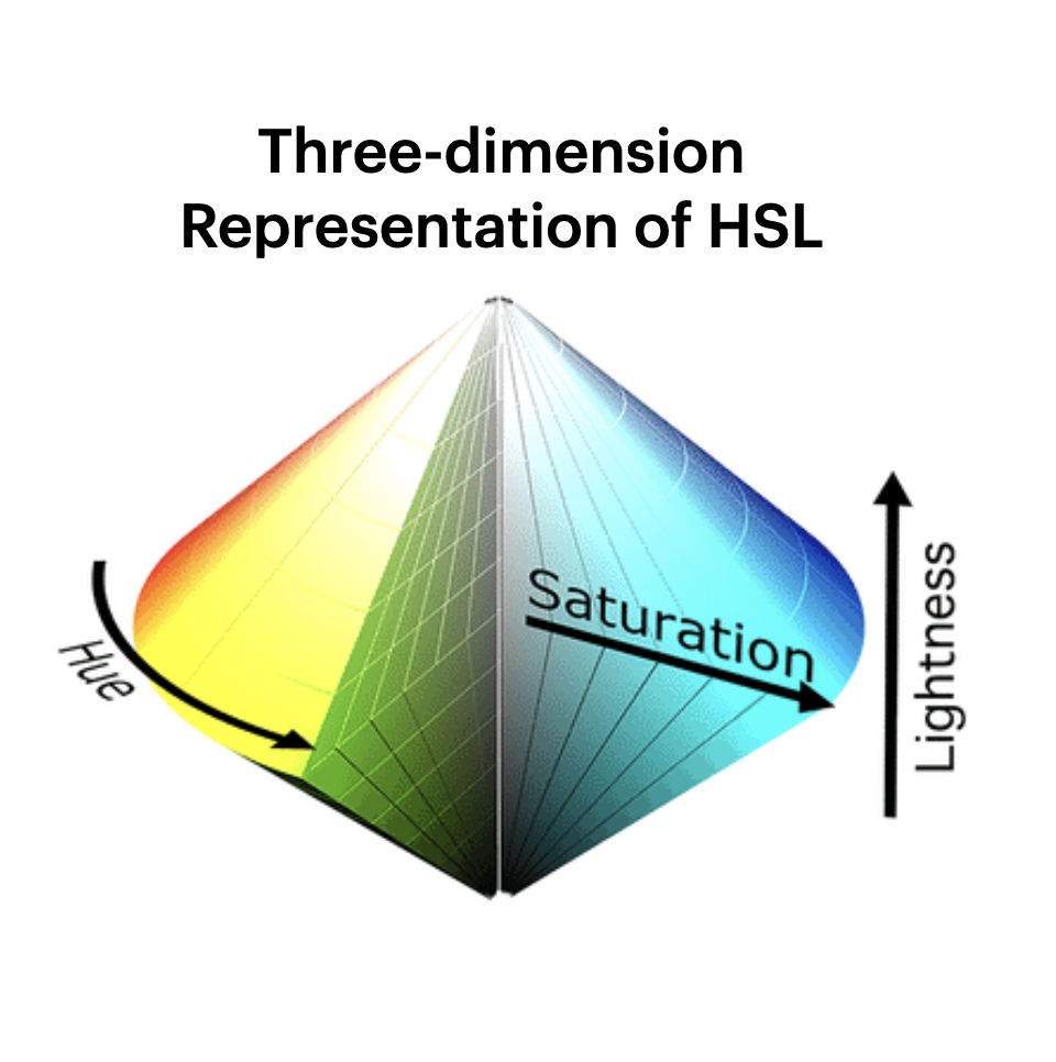
HSV / HSB
Hue, Saturation, Value/Brightness. HSV and HSB describe colour through its hue, intensity, and brightness. They are useful for making intuitive adjustments to colours in digital design software.
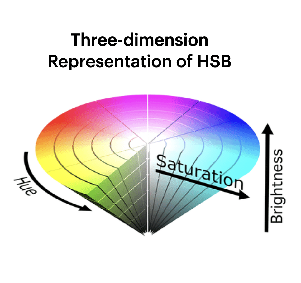
HSL
Hue, Saturation, Lightness. HSL organizes colour according to its hue, intensity, and relative lightness. It is especially useful for creating controlled lighter and darker variations of a colour.
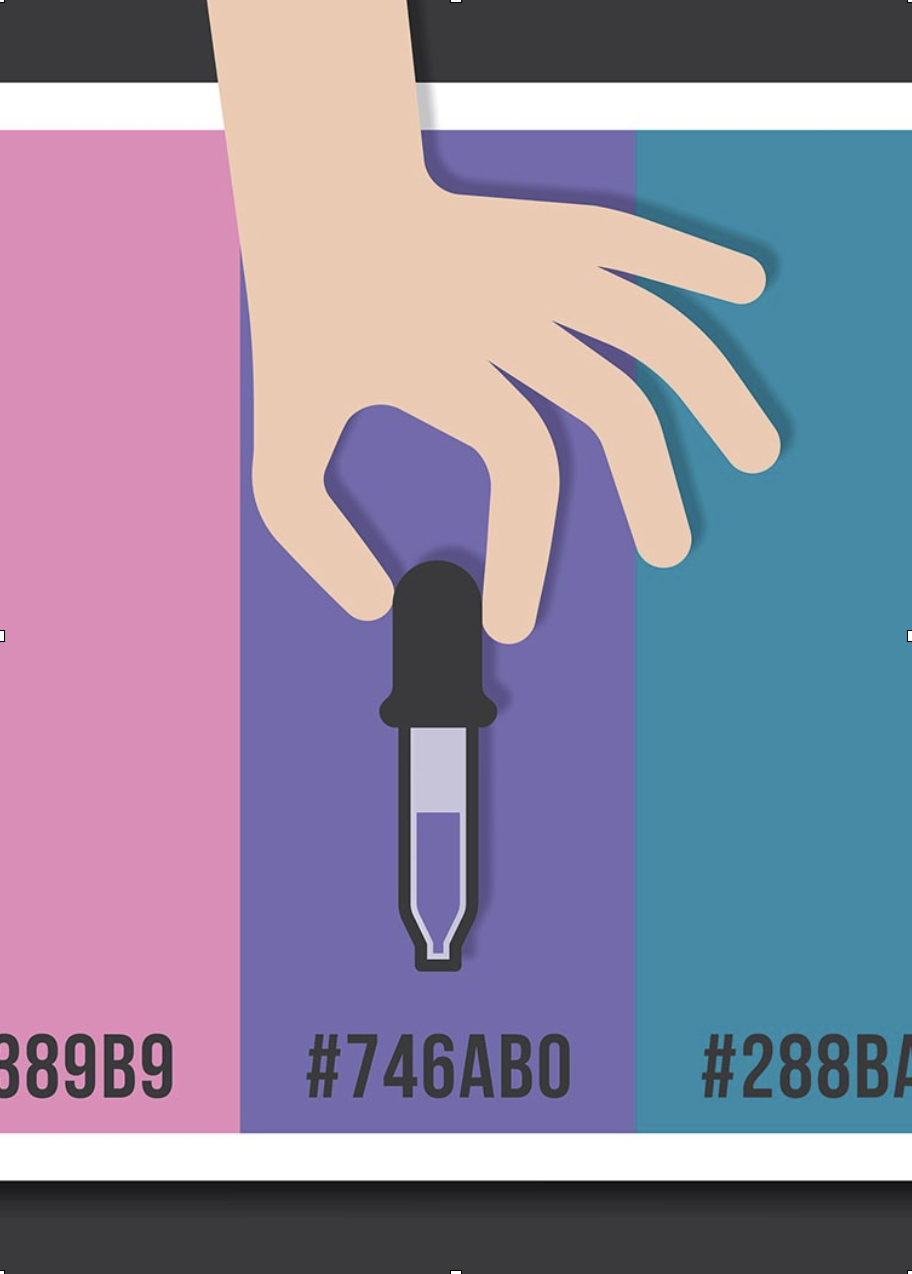
Hexadecimal
A hexadecimal colour code represents an RGB colour using six characters, such as #D94F70. Hex codes are commonly used to reproduce colours consistently in websites and other digital interfaces.
Remember: HSB and HSV describe the same basic model; some software uses the term Brightness, while other systems use Value.
Colour Schemes
A colour scheme is a structured relationship between colours on the colour wheel. For this activity, create one palette using each of the five schemes below.
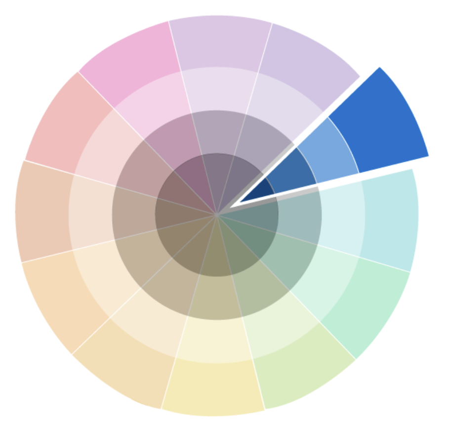
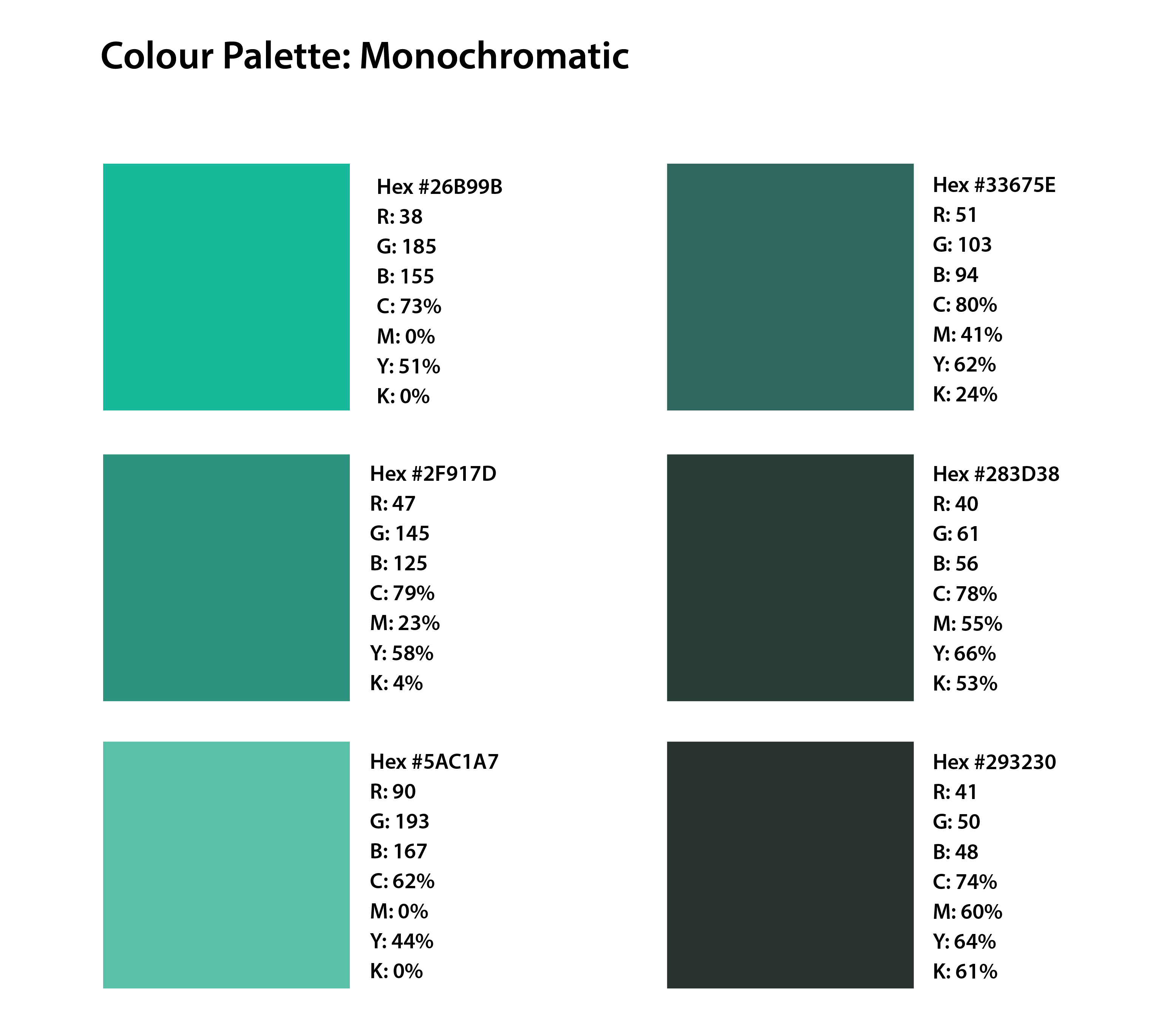
Monochromatic
Uses variations of a single hue. Differences in saturation, brightness, or lightness create contrast while maintaining a unified colour identity.
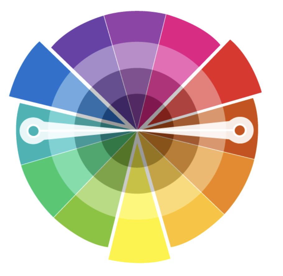
Complementary
Uses colours positioned opposite each other on the colour wheel. Their strong difference creates visual contrast and emphasis.
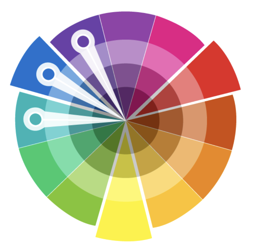
Analogous
Uses colours located next to each other on the colour wheel. Their shared characteristics create continuity and gradual visual transitions.
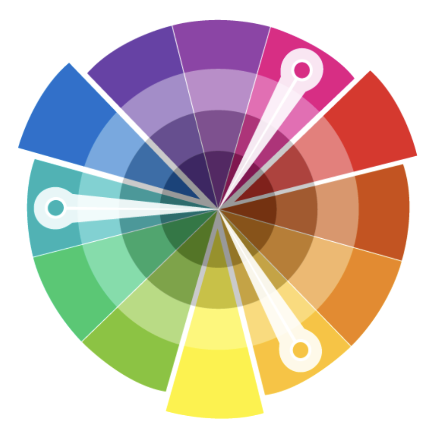
Triadic
Uses three colours distributed evenly around the colour wheel. The relationship can create variety while maintaining visual balance.
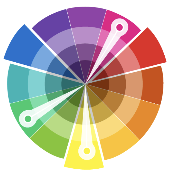
Split Complementary
Uses one base colour and the two colours adjacent to its complement. It creates strong contrast while offering more variation and less visual tension than a direct complementary scheme.
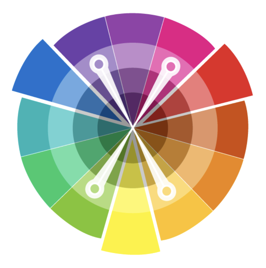
Tetradic / Square
Uses four colours spaced evenly around the colour wheel. Because the palette contains several strong colour relationships, careful proportioning is important.
Source: Wong, W. (1972). “Principles of Two Deimensional Design”. Van Nostrand Reinhold Company.
Johannes Itten — Colour Relationships
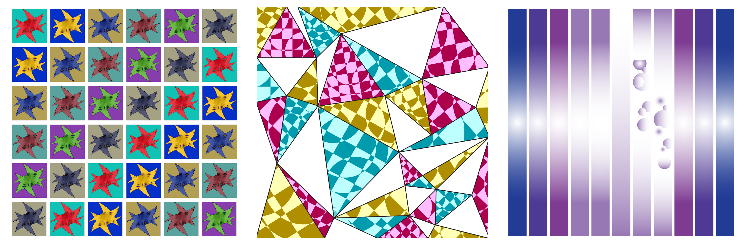
Johannes Itten explored how colours change visually according to their relationships with surrounding colours. For this activity, consider contrast, perspective, and gradation when applying colour to your compositions.
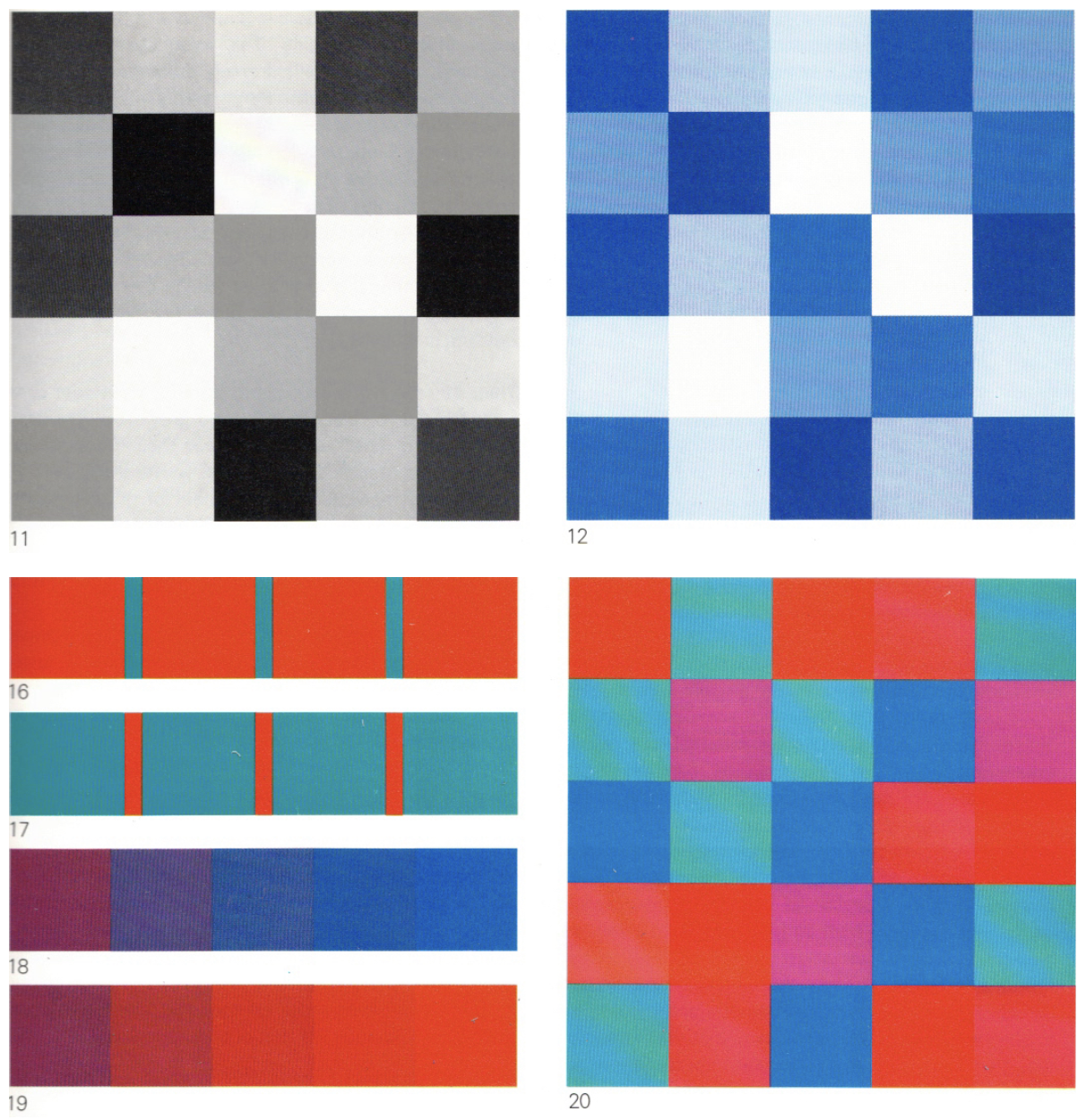
Colour Contrast
Colour contrast occurs when differences between colours make their relationship more visible. Contrast may be created through hue, light and dark, warm and cool colours, complementary relationships, saturation, or differences in the amount of colour.
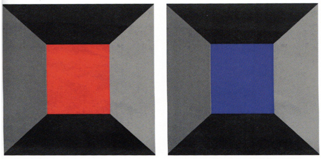
Colour Perspective
Colour can create the impression of spatial depth. Warm, bright, or highly saturated colours may appear to advance, while cooler, darker, or less saturated colours may appear to recede.
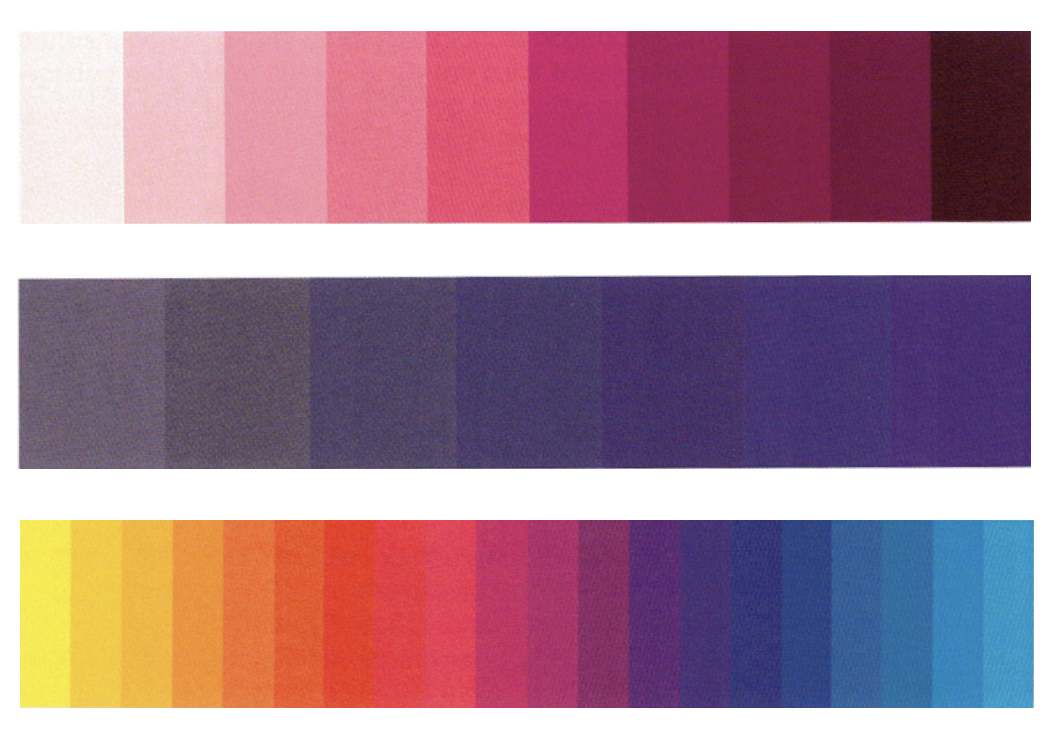
Colour Gradation
Colour gradation is a controlled progression from one colour condition to another. Gradual changes in hue, saturation, brightness, or lightness can create transition, rhythm, movement, and depth.
Source: Itten, J. (1970). Itten. The Elements of Color. A Treatise on The Color System of Johannes Itten based on his book The Art of Color. Edited and with a foreword and evaluation by Faber Birren. Translated by Ernst Van Hagen. Published by Van Nostrand Reinhold, New York, USA.
Timothy Samara — Colour Proportioning
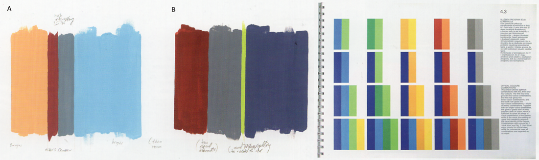
Colour proportioning considers how much visual space each colour occupies. Changing the relative amount of a colour changes its visual weight, hierarchy, emphasis, and relationship to the other colours in the composition.
For this activity, do not treat the six colours in a palette as equal. Establish a deliberate relationship between:
- Dominant colours — occupy the largest areas
- Secondary colours — support the dominant colour
- Accent colours — occupy smaller areas and create emphasis
Important: Colour proportioning is part of the composition. Two designs using exactly the same five colours can produce very different visual effects when the amount of each colour changes.
Source: Samara, T. (2007). “Color Fundamentals: Color Proportioning.” In Design Elements: A Graphic Style Manual (pp. 106-107). Rockport Publishers.